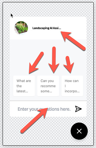
What is the best way to build a mobile view as when I change the mobile view, the desktop changes as well - I am sure it is not supposed to be like that.
Need help on this as it is causing issues with Mobile Views. If I adjust the mobile view, the webview is too small.
There aren’t separate mobile and desktop settings in Pickaxe—any changes you make will affect both views. This is because the design is responsive, meaning it adjusts dynamically based on screen size rather than having separate layouts for desktop and mobile.
If you’re running into layout issues, try adjusting elements using percentages or flex-based positioning instead of fixed widths. You can also preview how things adapt by resizing your browser window. Let me know what specifically you’re trying to adjust, and I can suggest some tweaks!
Lead designer @inck might be able to provide more input.
Hi Mike
Appreciate it, but I dont think it is really working the way you tink it should.
lets just take the title of the Pickaxe.
In order to see the title fully in the Mobile view, it needs to be like font size 10, but then on the desktop it is way to small.
Responsive is one thing when it comes to fitting things in the window, but nothing else scales the way it should.
Need some help to make this work.
As you know, a lot of people want to use this in a mobile setting,
Take a look at the image - even with font size 10, you still dont even get the full title.
There is so much wasted space.
The whole thing looks terrible.
Is this on the new system or the old system?
Still on the old system - should I switch ?
I took the plunge - wish I hadn’t Not a fan
The embed code as not completly broken everything I built for a specific use case. Not sure how I am going to recover from that one - which is going to cost me money in refunds.
I am not sure it is even ready for production use the way it is.
I just went to the design section - logo is missing from the button in the corner, the logo and title is not even showing up on the mobile version.
The icebreakers look terrible. - i only figured it out that you could move them - the avergae joe is not going to know to swipe and the text for teh box at teh bottom is so far to the left with no margin etc.
Had I only known before I hit Migrate.
I think you guys have got some major catch up to do.
I really don’t like it.
Coming back to this thread - I am absolutely mad about this.
I not cannot even go back and fix the issue I had with the headings as everything has changed - it is such a mess - I thought this was a redesign of hte front end, not a complete overhau that has ruined eveything I have been working on.
Sorry to hear that. Please send us any issues you encounter. We’re really excited about the new version. It’s a simpler way to do the same thing and will unlock lots of cool new functionality too.
Was just going to answer your question - but is deleted.
