V2 Icebreakers on mobile devices

Hi

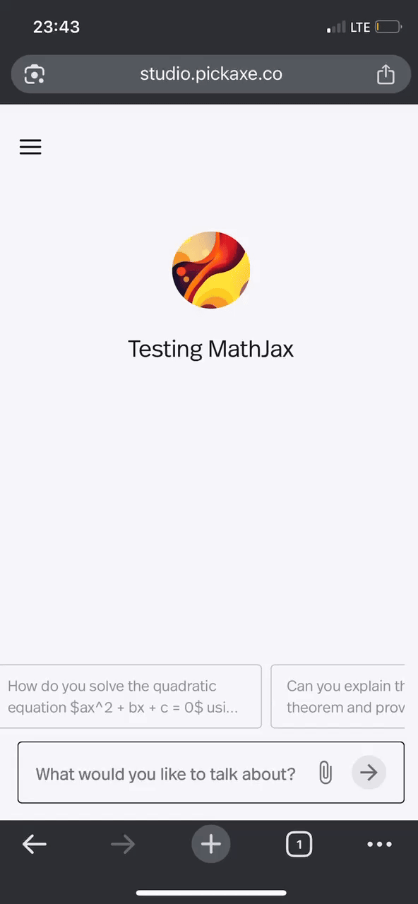
Loving the new V2 offering… the icebreakers though take up too much screen real estate when on a mobile device - I’d like an option to either disable the icebreakers when rendered mobile or to have them rendered like they were on Version 1 whne they took up a single line above the input box.

At present, with V2, each is rendered on its onw line which means the Pickaxe title and image are no longer displayed!

Thank you for your feedback! We’re always working hard to improve the customizability of Studio and appreciate you sharing your experience.

There is a way to achieve what you want by using the Website Code Injection tool, which you’ll find in the Settings tab of your Studio dashboard.

To remove icebreakers completely on mobile,
Add this to the header section of your Website Code Injection:

<style>
@media (max-width: 600px) {
  /* Target the parent div for all icebreakers */
  .absolute.bottom-full.right-0 > .flex.flex-col.gap-2.pb-4.px-2.justify-end {
    display: none !important;
  }
}
</style>

To make icebreakers more compact (fit on one line, scrollable) on mobile:

<style>
@media (max-width: 600px) {
  .absolute.bottom-full.right-0 > .flex.flex-col.gap-2.pb-4.px-2.justify-end {
    flex-direction: row !important;
    gap: 4px !important;
    overflow-x: auto !important;
    overflow-y: hidden !important;
    max-width: 100vw !important;
    width: 100vw !important;
    padding-bottom: 3vw !important;
    padding-left: 0 !important;
    padding-right: 0 !important;
  }
  .absolute.bottom-full.right-0 .group.flex.flex-grow.cursor-pointer {
    min-width: fit-content !important;
    max-width: 300px !important;
    white-space: nowrap !important;
    font-size: 13px !important;
    padding: 14px 10px !important;
    height: 48px !important;        
    align-items: center !important; 
  }
}
</style>

I know this is an old post but I’m having the same issue. You’re style snippet improves the size and lays the icebreakers horizonally but they don’t scroll. I’ve tried a few of my own attempts as well and it must be getting overridden somewhere. Any ideas?

A preview without the scripts or styles -

Hi @liveboldtravel,
Thank you for reaching out!

I found a way to keep the icebreakers horizontal and make them scrollable on mobile.

Here’s the code I used:

.absolute.bottom-full.right-0 > .flex.flex-col.gap-2.pb-4.px-2.justify-end {
    flex-direction: row !important;
    gap: 8px !important;
    overflow-x: auto !important;
    overflow-y: hidden !important;
    max-width: 100vw !important;
    padding-bottom: 12px !important;
    padding-left: 8px !important;
    padding-right: 8px !important;
    align-items: center !important;
    justify-content: flex-start !important;
    
    /* Enable smooth scrolling */
    scroll-behavior: smooth !important;
    -webkit-overflow-scrolling: touch !important;
}

/* Make the ice breaker items not shrink and have fixed width */
.absolute.bottom-full.right-0 > .flex > .relative {
    flex-shrink: 0 !important;
    min-width: 250px !important; /* Adjust this value as needed */
    max-width: 250px !important;
    width: 250px !important;
}

/* Optional: Hide scrollbar for cleaner look */
.absolute.bottom-full.right-0 > .flex.flex-col.gap-2.pb-4.px-2.justify-end::-webkit-scrollbar {
    height: 4px !important;
}

.absolute.bottom-full.right-0 > .flex.flex-col.gap-2.pb-4.px-2.justify-end::-webkit-scrollbar-thumb {
    background: rgba(0, 0, 0, 0.2) !important;
    border-radius: 2px !important;
}

And here’s a quick demonstration:
temp-temp

If you have any styling requests, feel free to let me know and I’ll be happy to help. Just keep in mind that this type of website code injection depends on the current DOM structure, so if the structure changes, the styling might break and require some small adjustments.

Perfect, thank you! I got that to work on my site as well, and will keep an eye on it during updates